So, you ‘ve spent longer than you can remember designing your product. You ‘ve studied the market and crunched the numbers.
Years of blood, sweat, tears, and the odd glass of red wine, have almost broken you, but it is finally done. Your masterpiece, your legacy is complete.
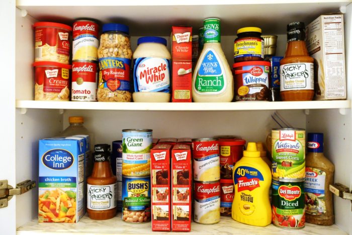
Whether you ‘ve created a robot that puts the kids to bed, or you ‘ve tried your hand at making DIY perfume that doesn ‘t smell like soap and vinegar, the image of the product is incredibly important.
Here is a list of the five most important tools that can help your product stand out on the shelves.
Colour
Different colours evoke different emotional reactions in people so this is a really simple way to make sure you are catching people ‘s attention whilst representing your brand effectively.
Here is a quick breakdown of what different colours say about your product.
This is just one of the tools that can be utilised when attempting to produce a consistent image of your brand or product.
Texture
Research shows that a brand ‘s impact increases by 30% when more than one sense is engaged in the packaging. Adding texture to your label is a fantastic way to set your product apart from the rest. This method is used a lot with higher end items. It shows the customer that this is the type of brand that really values quality and attention to detail.
Images
The placement of your brands logo on a label is important. Brand recognition is key and making your product instantly recognisable is crucial. It is also important to remember that not every customer is familiar with your product or your logo, so it needs to be clear exactly what the product is.
If your logo takes up the whole label, you can use a separate label containing any instructions, ingredients etc.
Shape
This may seem like an obvious point to make, but if your product is a bottle of champagne, then a star shaped label might not be appropriate. There is a whole load of standard stock shapes like banners, circles, ovals, hearts, shields, but a custom design may help make your product stand out. The important thing is to make it consistent and relevant to your brand.
Size
This will depend entirely on whether your product is toy car sized or real car sized. A label should be clearly visible but should not dominate the product. The size of the label will also depend on the shape of the product and the label placement. Play around with different ideas but remember to keep a consistent image that reflects your brand positively.
At CDP, we have a wealth of experience in helping companies achieve brand consistency. We can offer as much or as little help in the design process as you require, ensuring your creativity and style isn ‘t compromised, but complimented by our professional touch. To find out more, drop us an email: info@77.104.173.120
74-82 Rose Lane,
Liverpool,
L18 8EE
Tel: 0151 724 7000
Fax: 0151 724 6478
Unit 1,
Tomo Industrial Estate,
Packet Boat Lane,
Cowley,
Uxbridge,
UB8 2JP
Tel: 01895 462462
Fax: 01895 420911